

Unifying a messy product suite, saving £250k along the way...
The Challenge
Landmark had hoovered up a bunch of products over the years and they were all over the place. Different experiences, different systems, confused customers. Some of the internal software was so old that team members were younger than the tools they were using. My job was to bring it all together.
The Approach
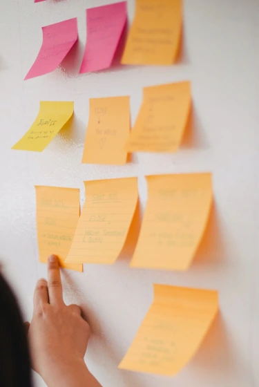
Workshops with stakeholders
Started by getting Customer Services and Sales in a room. They knew what customers were talking about every day, not what we assumed they cared about.
User research
Spoke to conveyancers across the UK to understand their workflows. Turns out they had some creative workarounds for our clunky software.
Competitor analysis
Looked at what others in the space were doing. Some good ideas to take on board, some mistakes to avoid.
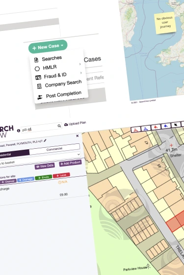
Journey mapping
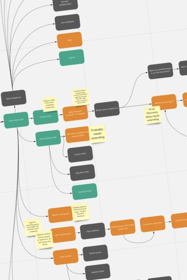
Mapped out the full customer journey from search to completion. Found a few spots where we were making life unnecessarily difficult.

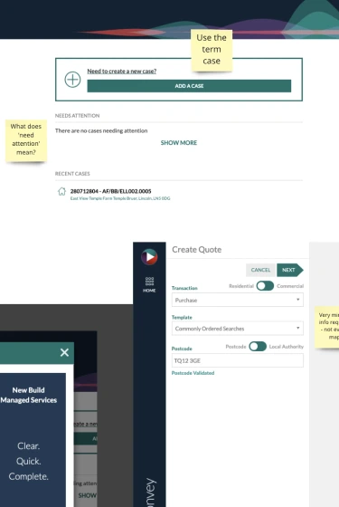
Prototyping
Built out concepts in Figma and got them in front of users quickly. No point polishing something that might be wrong.
Usability testing
Tested with real conveyancers doing real tasks. Watched them struggle, took notes, went back to the drawing board to finalise ideas...
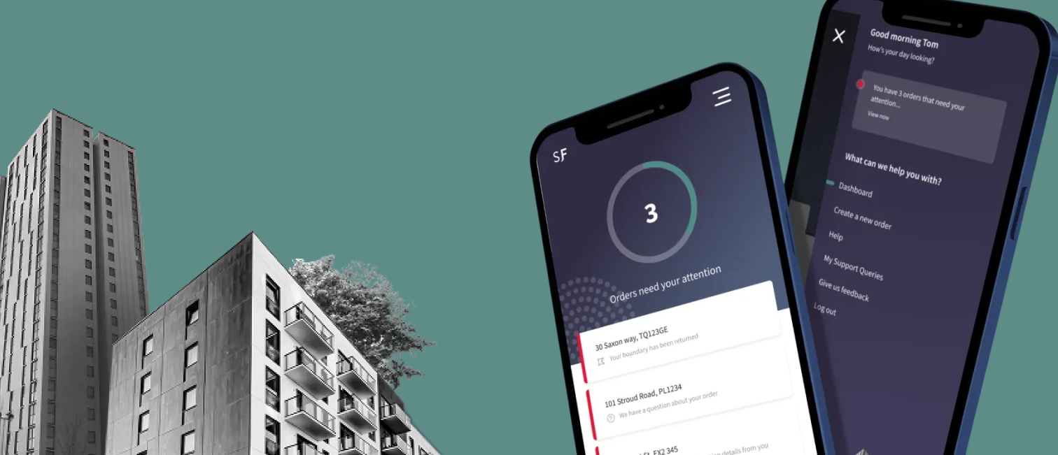
The Solution
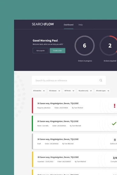
Built a unified design system that could flex across all the different products while keeping them feeling like one family. The components were configurable enough to handle sub-branding without becoming a mess.
Along the way, I noticed we were paying the Land Registry for data we already had. Flagged it, fixed it, saved the company £250k a year. Not bad for a side effect of good research.
The Outcomes
- Removed Land Registry dependency
- Faster purchase completion
- Better user experience
- Design system shared across products
- Much faster prototyping
Want to see more?
I designed, tested, and optimised the upsell module that made Cadbury over £100k in extra revenue every month. Started with research into how users make pricing decisions, then experimented until the numbers proved it worked.
Learn more
I led design and research for SideQuest, a VR gaming marketplace serving 500,000+ users. A highlight was the Indie Alliance, a gamified discovery platform for VR games built on a design system made to scale.
Learn more
I've been lucky to work with...